It’s pretty common for database-driven apps to display a “last updated” field. For instance, here is a screenshot of my Mail app on my iPhone, showing that my emails were “Updated Just Now”.

And here is a screenshot from the RealTimeTrains app, showing that the information was “Updated a few seconds ago”.
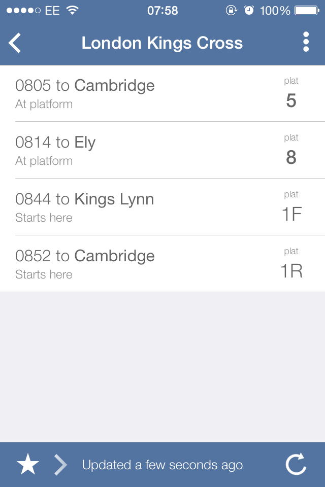
Why do apps insist on using relative timestamps like this? It’s all very well having a piece of text to say that the information was “just updated”, but how do I know that the piece of text itself is up-to-date?
(It’s a bit like those “Lost Cat” posters that say “missing since last Friday” and are then left up for months.)
If instead the text gave an absolute timestamp like “Updated at 07:57”, then I would know that the information is up to date, and that the app hasn’t simply gotten stuck.
